
A few weeks ago, I covered how to install and get started with Manim and Python in a blog post and also made a YouTube video about it:
In today’s post, I want to expand on Manim and show how we can use it to create bar chart animations.
Previously, I made a YouTube video about animating bar charts with Python and a library based on Matplotlib. I modified the library to place images on each bar chart but it always felt a bit hacky. As such, this is an opportunity to revisit that video and create more pleasing data visualization animations.
Taking a Look At the Data
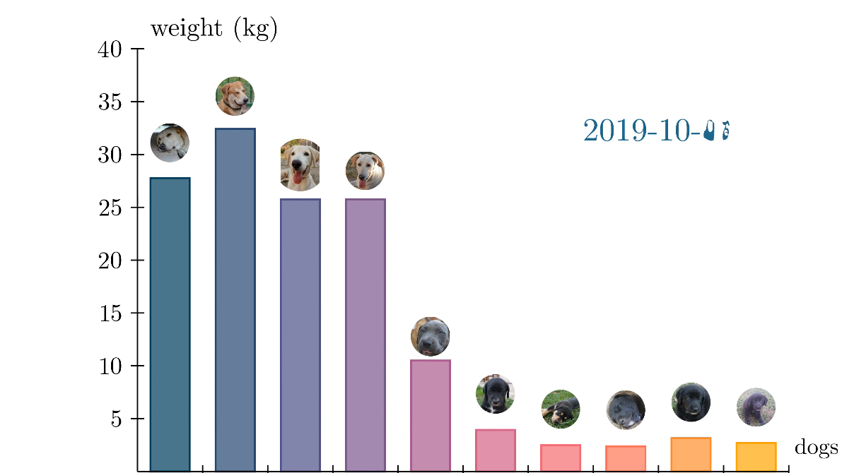
As in my previous bar chart video, I’ll be using a puppy growth dataset I collected when our dog had eight puppies a few years ago. There is data for 10 dogs in total: 8 puppies, their mother, and another dog that was adopted several months after the puppies were born.
I collected their weight as often as possible. However, there were occasions when I could only weigh part of the litter, so there are missing values in some entries. Moreover, four of the puppies were adopted early on and their data stopped growing.
Here is a snippet of the data:
from pathlib import Path

file_name = Path('puppy_weights.csv')
root_folder = Path('data')
file_path = root_folder / file_name

csv_df = pd.read_csv(file_path).set_index('Date')
csv_df /= 1000     #convert grams to kilograms
csv_df.head(7)
| Date | Emma | Simba | Ragnar | Luna | Rolo | Big Black | Jucumari | Tiny | Black1 | Black2 |
|---|---|---|---|---|---|---|---|---|---|---|
| 2019-03-12 | 28.0 | 0.000 | 0.000 | 0.000 | 0.0 | 0.000 | 0.000 | 0.000 | 0.000 | 0.000 |
| 2019-03-14 | 28.0 | 0.364 | 0.439 | 0.310 | 0.0 | 0.414 | 0.343 | 0.272 | 0.378 | 0.377 |
| 2019-03-16 | 28.0 | 0.477 | 0.545 | 0.383 | 0.0 | 0.519 | 0.410 | 0.350 | 0.499 | 0.496 |
| 2019-03-18 | 28.0 | 0.590 | 0.658 | 0.473 | 0.0 | 0.609 | 0.518 | 0.405 | 0.607 | 0.606 |
| 2019-03-19 | 28.0 | 0.666 | 0.718 | 0.504 | 0.0 | 0.668 | 0.562 | 0.460 | 0.704 | 0.698 |
| 2019-03-20 | 28.0 | 0.714 | 0.754 | 0.560 | 0.0 | 0.704 | 0.615 | 0.500 | 0.746 | 0.720 |
| 2019-03-21 | 28.0 | 0.775 | 0.825 | 0.637 | 0.0 | 0.784 | 0.663 | 0.543 | 0.812 | 0.794 |
Interpolation of Missing Values
I decided to deal with missing values and by using the interpolate function in pandas. It will fill-in missing values in a dataset based on parameters passed to it. I left it with its default behavior, which fills a missing entry with the average of the values immediately before and after the missing value. In case there isn’t a value after, it will just repeat the last value.
csv_df.interpolate(axis=0,inplace=True)
Static Bar Charts With Manim’s BarChart Class
Conveniently, Manim already has BarChart class that does most of what we want. As a start, here is how you would create a static bar chart with Manim. This is an example from the documentation page. We’ll look at how to animate it later.
from manim import *

class BarChartExample(Scene):
    def construct(self):
        chart = BarChart(
            values=[-5, 40, -10, 20, -3],
            bar_names=["one", "two", "three", "four", "five"],
            y_range=[-20, 50, 10],
            y_length=6,
            x_length=10,
            x_axis_config={"font_size": 36},
        )

        c_bar_lbls = chart.get_bar_labels(font_size=48)

        self.add(chart, c_bar_lbls)

Animation With Linear Progression
We can also make simple animations by making use of BarChart’s built-in method change_bar_values. In this case, we provide the starting and final values and let Manim animate them. We can choose different animation rates from here. I’ll use the default linear progression for this example.
class ChangeBarValuesExample(Scene):
    def construct(self):
        values=[28, 0, 0, 0, 0, 0, 0, 0, 0, 0]
        final_values = [33.1, 36, 29.25, 33.58, 4, 4.5, 5, 4.3, 7.2, 5.5]

        chart = BarChart(
            values,
            y_range=[0, 40, 5],
            y_length=6.5,
            x_length=10,
            y_axis_config={"font_size": 24},
        )
        self.play(Create(chart))
        self.wait(2)

        self.play(chart.animate.change_bar_values(final_values), run_time=3)
        self.play(Create(chart.get_bar_labels(font_size=36)))

        self.wait(3)
Animation With Step-By-Step Values
Since I want to animate the puppy dataset, I would like for the animation to go over all the data points I collected and not just the beginning and final ones. Unfortunately, I could not find an easy and built-in way to accomplish this with Manim.
The hacky solution I came up with involves using a for-loop that repeatedly calls chart.animate.change_bar_values on new values of data given by pandas’ itertuples method. Equally important is to select a linear rate function for the animation. If you select some other type of rate function, the animation will look strange and will seem to stop and start again at each data point.
Additionally, we are going to be using images on top of each bar. The images are pictures of each puppy were are tracking, and they are on a folder in the repository. Check the Jupyter notebook to see how I got their paths.
Here is the Python code used and the resulting animation:
%%manim -ql AnimatedBarChartWithImages

class AnimatedBarChartWithImages(Scene):
    def construct(self):
        self.camera.background_color = WHITE

        bar_names = csv_df.columns

        chart = BarChart(
            values = csv_df.iloc[0].to_list(),
            bar_names=bar_names,
            y_range=[0,40, 5],
            y_length=6.5,
            x_length=10,
            x_axis_config={
                "font_size":20,
                'label_direction':DOWN,
            },
            axis_config = {
                'color':BLACK,
                'tip_shape': StealthTip,
            }
        )

        #==================================
        # Load images
        img_dic = {}    #the following nested for-loop seems very inefficient, but I'm too tired to think
        for puppy_name in bar_names:
            for file in img_files:
                if puppy_name == file.stem:
                    img_dic[puppy_name] = file
                    break

        images = []

        dic_image_mobjects = {}
        for puppy_name, bar in zip(bar_names, chart.bars):
            img_path  = img_dic.get(puppy_name)
            img       = ImageMobject(img_path)
            img.width = chart.bars[0].width
            img.next_to(bar, UP)

            images.append(img)

            dic_image_mobjects[puppy_name] = img

        #==================================
        # this section is to set the axis tick color. The best solution I found was the following for loops
        # from this reddit post:
        # <https://www.reddit.com/r/manim/comments/x7iqzp/colors_of_axis_text_for_barchart/>

        for tick in chart.get_x_axis():
            tick.set_color(BLACK)

        for tick in chart.get_y_axis():
            tick.set_color(BLACK)

        #==================================
        # determine labels for the chart
        labels = chart.get_axis_labels(
            Tex("dogs", color=BLACK).scale(0.7),
						Tex("weight (kg)", color=BLACK).scale(0.8)
        )

        #==================================
        self.add(chart, labels)
        self.add(*[img.next_to(bar, UP) for img, bar in zip(images, chart.bars)])

        date_text = Tex(csv_df.index[0], color=BLUE_E)
        date_text.move_to(UP*2 + RIGHT*3)
        self.play(Create(date_text))

        for i, row in enumerate(csv_df.itertuples()):
            date_str = row[0]
            new_date = Tex(date_str, color=BLUE_E)
            weights  = list(row[1:])  #first item is the date

            if i == 0:
                continue

            elif i > 10:  #comment out to render the full animation
                break

            self.play(
                chart.animate.change_bar_values(weights),
                *[img.animate.next_to(bar, UP) for img, bar in zip(images, chart.bars)],
                date_text.animate.become(new_date, match_center=True, match_height=True,),
                rate_func=linear,
                run_time=0.2,
            )
I’ll break down the code into the most relevant pieces so it is easier to follow.
Creating the Initial BarChart Mobject
In the first part of the code, we create a BarChart object with the initial values from the dataset:
chart = BarChart(
	values = csv_df.iloc[0].to_list(),
	bar_names=bar_names,
	y_range=[0,40, 5],
	y_length=6.5,
	x_length=10,
	x_axis_config={
	    "font_size":20,
	    'label_direction':DOWN,
	},
	axis_config = {
	    'color':BLACK,
	    'tip_shape': StealthTip,
	}
)
We are also extracting the column names from the dataset to use as bar names. Here is a short explanation of the other parameters:
y_range: [min value of the y-axis, max value of the y-axis, tick frequency (5 means that there will be a tick at 5, 10, 15, 20, etc)x_length/y_length: Size of the y and x axes respectively on the canvasx_axis_config/y_axis_config: A dictionary of parameters to pass to the underlyingNumberPlaneclass to configure each axis individually.axis_config: Here you can pass a dictionary with configuration parameters that will affect both axes at the same time
Loading Images And Placing Them Next To Each Bar
The puppy images are stored under the folder images at the same level as the Jupyter notebook. To load the files, I used the Pathlib library:
all_paths = Path('images').glob('**/*')

img_files = [f for f in all_paths if f.is_file()]
[PosixPath('images/Tiny.png'),
 PosixPath('images/Simba.png'),
 PosixPath('images/Rolo.png'),
 PosixPath('images/Ragnar.png'),
 PosixPath('images/Luna.png'),
 PosixPath('images/Jucumari.png'),
 PosixPath('images/Emma.png'),
 PosixPath('images/Black2.png'),
 PosixPath('images/Black1.png'),
 PosixPath('images/Big Black.png')]
Then, inside the main scene, we are creating ImageMobject objects with each image file.
...

# Load images
img_dic = {}    #the following nested for-loop seems very inefficient, but I'm too tired to think
for puppy_name in bar_names:
  for file in img_files:
    if puppy_name == file.stem:
        img_dic[puppy_name] = file
        break

for puppy_name, bar in zip(bar_names, chart.bars):
	img_path  = img_dic.get(puppy_name)
	img       = ImageMobject(img_path)     # <--- HERE WE CREATE IMAGEMOBJECTS
	img.width = chart.bars[0].width
	img.next_to(bar, UP)

...
ImageMobject is a way to display external images into manim. Additionally, you can pass any numpy array to represent an image instead of a file.
Displaying The Chart
#==================================
...
self.add(chart, labels)
self.add(*[img.next_to(bar, UP) for img, bar in zip(images, chart.bars)])

date_text = Tex(csv_df.index[0], color=BLUE_E)
date_text.move_to(UP*2 + RIGHT*3)
self.play(Create(date_text))
In the snippet above, the first two lines add the chart, labels and puppy images directly on the canvas without animating them. The next three lines before the for-loop create a text object date_text which will keep track of the date of each row of data. We will update this object in the main loop.
Running The Main Loop
I’ll leave other parts of the code to the reader to go through, so we can give more time to the main loop at the bottom of the function:
...
for i, row in enumerate(csv_df.itertuples()):
    date_str = row[0]
    new_date = Tex(date_str, color=BLUE_E)
    weights  = list(row[1:])  #first item is the date

    if i == 0:
        continue

    elif i > 10:  #comment out to render the full animation
        break

    self.play(
        chart.animate.change_bar_values(weights),
        *[img.animate.next_to(bar, UP) for img, bar in zip(images, chart.bars)],
        date_text.animate.become(new_date, match_center=True, match_height=True,),
        rate_func=linear,
        run_time=0.2,
    )
To animate the dataset, I’m getting each row of data from the pandas dataframe using itertuples(), while enumerating the result and keeping track of the index with variable i.
The first step inside the for-loop is to extract the weight and date data from the row given by the dataframe. We then create a new Tex object with the next date and use it to update the date on screen.
Next, the if statement there simply prevents the animation to use the first row of data, since it was already included with the initial chart. The elif statement helps me render part of the animation to test it.
Finally, we get to the self.play section. This is where the actual animation happens. The first line animates the bars with the new values coming from the pandas dataframe. The second animation is the one that updates the position of the puppy images to always stay on top of their respective bars. Next, the third line is the one that animates the Tex object to display an updated date. After that, I chose to use a linear rate function. As I explained before, we need a linear rate function for the animation to look smooth and continuous from data point to data point.
The run_time parameter is set to 0.2 seconds because that is how long it will take to animate each data point. If you set this parameter to 0.1 seconds, the animation will go twice as fast.
Conclusion
Hopefully you found this post useful and informative. Check the repository here to get access to the Jupyter notebook with the code. And, if you need a refresher on how to install and get started with Manim, read my last post about it. Let me know in the comments if there are other topics of interest I could cover.