
In today’s post, we will cover the basics of the web framework Streamlit. I am especially interested in Streamlit’s focus on data science applications. Therefore, we will build a simple web app with some data visualization on a housing price dataset. Read until the end to see a working example. At the same time, I want to see how it compares to Flask in ease of use and flexibility. I previously wrote these posts on building a web app with Flask and a MySQL databse, so they will serve as a comparison:
- https://andresberejnoi.com/blog/building-a-simple-flask-app-with-sqlalchemy/
- https://andresberejnoi.com/blog/how-to-use-sqlalchemy-and-python-to-read-and-write-to-your-database/
There might be referral links to books I used or recommend on this topic below.
Project Scope
For this project, we will create a simple multi-page app that displays information on California’s housing data, such as the raw dataframe, and a map of the population clusters used in the dataset. By the way, I borrowed this dataset from the third edition of the book “Hands-On Machine Learning with Scikit-Learn, Keras, and TensorFlow” by Aurélien Géron. I recommend checking it out if you are interested in improving your machine learning skills. Additionally, here are two potentially interesting books on developing and deploying Streamlit apps (I have not personally read them yet):
- Streamlit for Data Science: Create interactive data apps in Python
- Getting Started with Streamlit for Data Science: Create and deploy Streamlit web applications from scratch in Python
I deployed the app for today’s project on Streamlit Community site for free, and you can take a look at it here.
How To Install Streamlit
You can find installation instructions on Streamlit’s documentation page, but basically, the two easiest methods are using pip and conda:
- Note: I highly recommend creating a virtual environment before installing Streamlit.
- With pip
#this method is the recommended one on the documentation page
pip install streamlit
- Using Conda:
conda install -c conda-forge::streamlit
Loading the Data And Displaying It
Streamlit makes it really easy to quickly show data. For any Streamlit project, we need an entry-point Python file. We will call it “Home.py”. Keep in mind that the file name will be automatically used as the page name; that’s why I capitalized it.
In our “Home.py” file, we can load the data as a pandas dataframe and it will be displayed on the page.
import streamlit as st
import pandas as pd

df = pd.read_csv("datasets/housing.csv")
st.markdown("#Raw Housing Data")

df
Then from the terminal, in the same folder as the project, we run the app:
streamlit run Home.py
Now we should see a URL on the terminal where we can find the app. The website should look something like this:

Notice that we didn’t explicitly tell Streamlit to display the dataframe on the page. It happens automatically when a variable name is typed without any other expression.
Personally, I prefer to explicitly tell Streamlit how to display my data. For instance, we can use st.dataframe to display an interactive dataframe, or st.data_editor(df) to be able to modify entries in the dataframe:
import streamlit as st
import pandas as pd

df = pd.read_csv('datasets/housing.csv')

st.markdown("# Raw Housing Data")
st.data_editor(
    df,
    num_rows='dynamic', #allows deleting entire rows
)
Adding A Map With Streamlit.map
One neat feature of Streamlit is its built-in API for displaying data on a map using st.map. It uses Mapbox under the hood. The Streamlit documentation mentions that Mapbox requires an API token to use. However, Streamlit is providing their own token so we don’t have to worry about it (this may change in the future). If you encounter issues where the map is not displayed, you may need to create your own token and configure Streamlit to use it; just follow the st.map documentation above.
The code to add a map is surprisingly simple:
#display a simple map
st.map(
    df,
    longitude='longitude',
    latitude='latitude',
    size='population',
    #color='population',
)
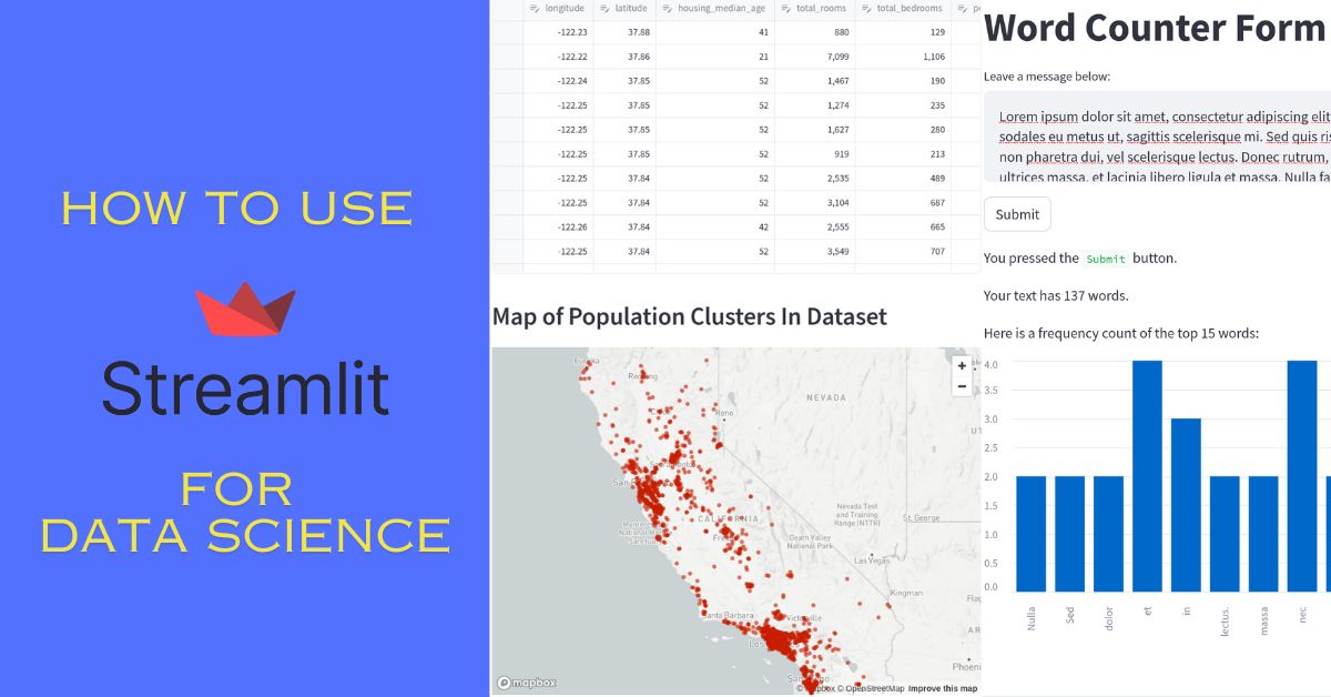
As you can see, st.map expects a dataframe or similar data structure as the first argument. This dataframe should contain columns with latitude and longitude values. Conveniently, st.map also supports passing size and color columns. Size controls the size of each data point plotted on the map. Color, as the name indicates, controls the color of the points. We can pass a single color for the entire dataset, or we can provide a different color for each point on the map by providing a list of colors or the name of a column in the dataframe containing color hex values.
In the example above, I used the “population” column from the dataframe as the size.
Here is an overlook of the map:

When we zoom in the map, we can see that the dots vary in size based on the population value:

Adding More Pages to Streamlit App
So far, we have created a single page for our app. To add more, Streamlit expects a folder called “pages” at the same level as our entry script. We will put all of the sub-pages under this folder and they will show up in the sidebar of our Streamlit application in alphabetical order. For instance, let’s add an information page with useful links and another page with a form that counts the word frequency in the text entered. Here is the project structure now:
your-root-folder/
|---- Home.py
|---- pages/
|     |---- Info.py
|     |---- Word_Counter.py
Streamlit will automatically show Info.py first since pages are sorted alphabetically. However, there are ways to force a certain order. The simplest is to add a number followed by an underscore in front of the file name. Additionally, you can even add emojis directly to the file name. Take a look at both of these examples:
your-root-folder/
|---- Home.py
|---- pages/
|     |---- 1_Info.py
|     |---- 2_Word_Counter.py
your-root-folder/
|---- Home.py
|---- pages/
|     |---- ℹ️_Info.py
|     |---- 📝_Word_Counter.py
When you look again at your running app, you should see a side bar like this one:

Now, lets actually fill those pages with interesting stuff.
ℹ️_Info.py
In this page I will simply add some links to my post, my Github repository, and some Streamlit documentation pages used for the project.
Here is the code:
import streamlit as st

st.title("Project Information")

st.markdown("This is an example project to show the basics of Streamlit.")
st.markdown("Here is a [blog post](https://andresberejnoi.com/blog/build-a-simple-data-science-app-with-streamlit/) explaining how this page was made. Additionally, here is the link to the [Github repository](<https://github.com/andresberejnoi/Streamlit-Apps/tree/main/Housing%20Prices>) for the project.")

st.markdown("""
    ### Streamlit Elements Used:
* [st.data_editor](<https://docs.streamlit.io/library/api-reference/data/st.data_editor>)
* [st.map](<https://docs.streamlit.io/library/api-reference/charts/st.map>)
* [st.form](<https://docs.streamlit.io/library/api-reference/control-flow/st.form>)
* [st.text_area](<https://docs.streamlit.io/library/api-reference/widgets/st.text_area>)
""")
📝_Word_Counter.py
For this page, I decided to have some fun and add a simple text submission form using Streamlit’s form component. If you type something into the text box and click submit, the app will tell you how many words were in the text and display the 15 most used words as a bar chart.
The code for st.form is very intuitive. You can add elements to a form by using Python’s with statement. Here is my code for this page:
import streamlit as st
from collections import Counter

with st.form("counter_form"):
    st.title("Word Counter Form")
    txt = st.text_area("Leave a message below:")

    submitted = st.form_submit_button("Submit")   #every form must contain st.form_submit_button
    if submitted:  #do something with the data entered
        num_words = len(txt.split())
        st.write("You pressed the `Submit` button.")
        st.write(f"Your text has {num_words} words.")

        if num_words > 0:
            st.write(f"Here is a frequency count of the top 15 words:")
            words = txt.split()
            word_frequency = Counter(words)
            top_15_words = word_frequency.most_common()[:15]

            st.bar_chart(dict(top_15_words))
Now if you go to the word counter sub-page and enter some text in the input area, you should get an output like this one:

Conclusions
Streamlit is much easier to use out of the box than something like Flask. I was able to build a simple application in a matter of minutes just with some help from the documentation. Therefore, I will keep exploring this tool and building real projects with it. I also enjoyed the fact that you can deploy Streamlit apps for free on the community page with just the click of a button. That’s how I deployed the example in this post.
As always, let me know if you have any questions or comments down below.
You can also subscribe to my YouTube channel for videos on Python projects, automation, and crypto:
Finally, if you want to stay connected and up to date on what I post, you can join my newsletter here. I want this newsletter to be a useful resource of tips and tricks I learn and also a place to talk about new projects I might work on.