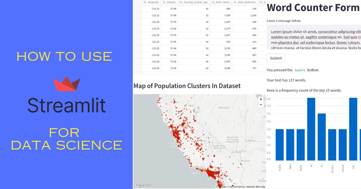
In today’s post, we will cover the basics of the web framework Streamlit. I am especially interested in Streamlit’s focus on data science applications. Therefore, we will build a simple web app with some data visualization on a housing price dataset. Read until the end to see a working example. At the same time, I…
All posts in Data Visualization
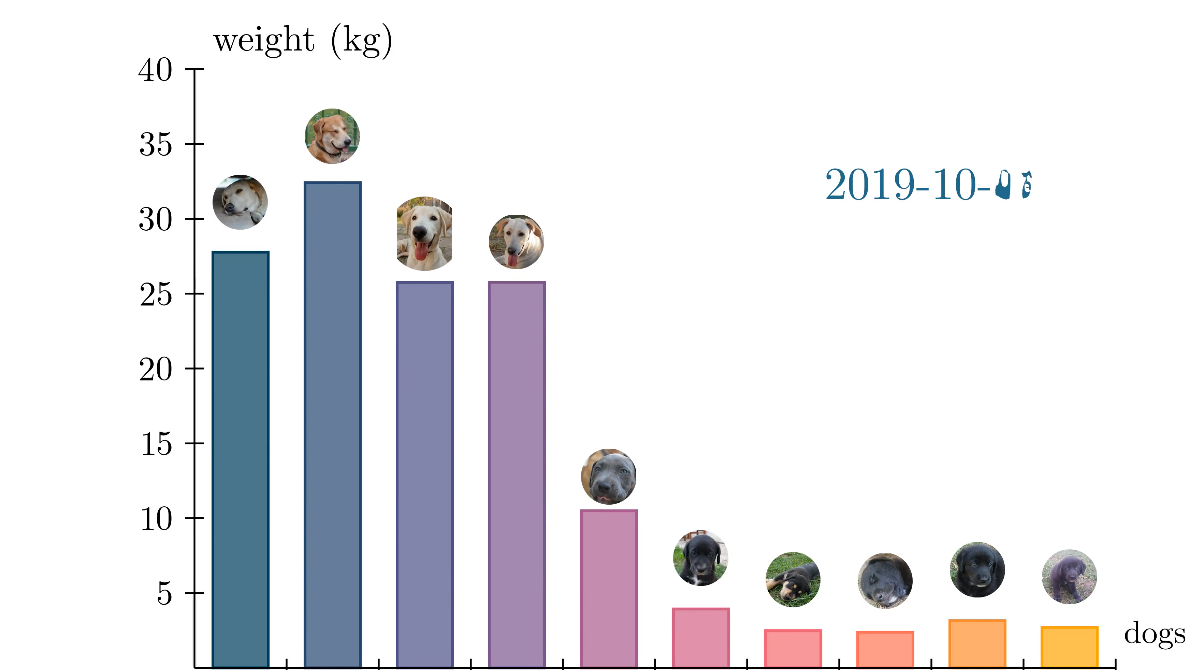
Data Visualization: Bar Chart Animations With Manim
A few weeks ago, I covered how to install and get started with Manim and Python in a blog post and also made a YouTube video about it: In today’s post, I want to expand on Manim and show how we can use it to create bar chart animations. Previously, I made a YouTube video…
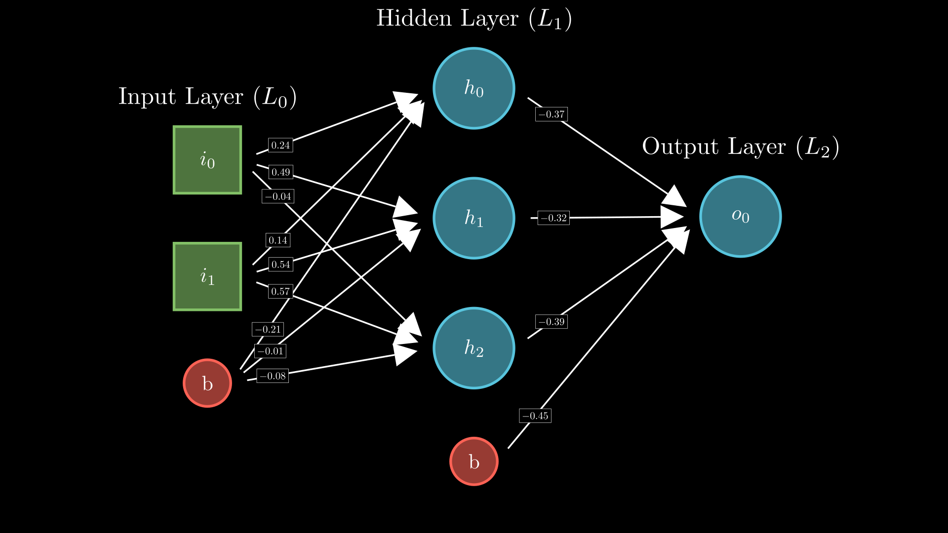
Using Manim and Python to Create Animations Like 3Blue1Brown
If you’ve ever been mesmerized by Grant Sanderson’s fluid and captivating animations on his YouTube channel, 3Blue1Brown, you might be wondering how he creates them. The answer lies in a homemade animation engine called Manim, built with Python. While Grant Sanderson’s original version is available, he recommends beginners start with the community edition. This version…
Interactive Plots With Bokeh And Flask
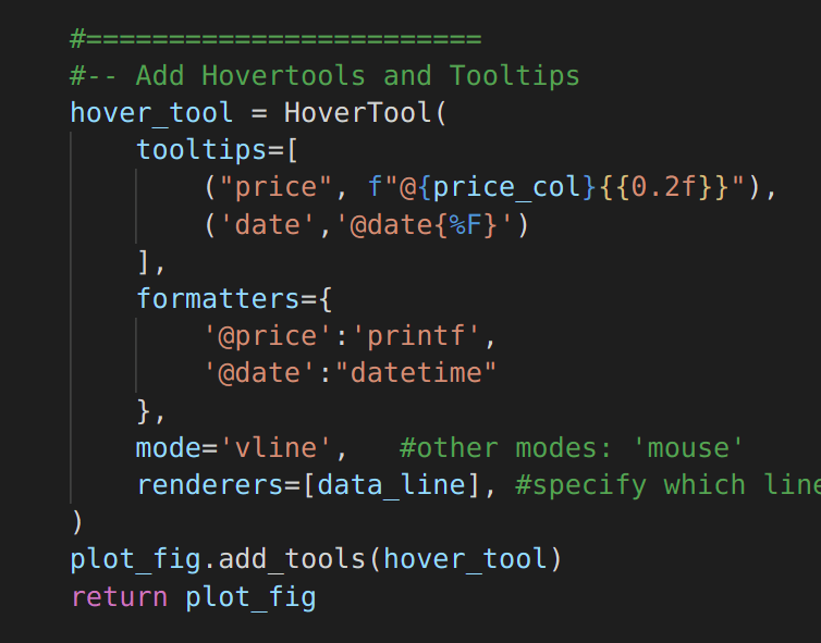
Adding interactive plots to a Flask application can be a simple process. There are several methods to accomplish this, but today I will focus on a graphical Python library called Bokeh. If you have been following my posts, I wrote an article about creating a Flask web app with a MySQL database in the background.…
Advanced Plots With Pandas and Matplotlib
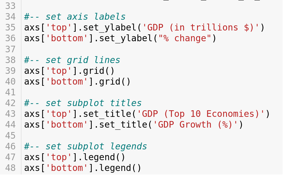
Today we will explore how to build more complex plots using pandas and matplotlib. Last week, I wrote a post covering common plots that can be created with these libraries. However, I did not get a chance to go deeper into them. Therefore, you can consider this as a follow-up to that post. First, I’ll…
How to Create Plots With Pandas and Matplotlib
Learn how to do data visualization with pandas and matplotlib. With these examples, you can turn the default charts into descriptive plots.